Hi,
this time I wanted to bring in a new element that I often use, but never discussed or pointed out in one of my previous posts. The use of color gradients in the processing of my textured photographs. I became aware of the importance of gradients during my work for the app Stackables and now use them in my processing of iPhone shots more frequently.
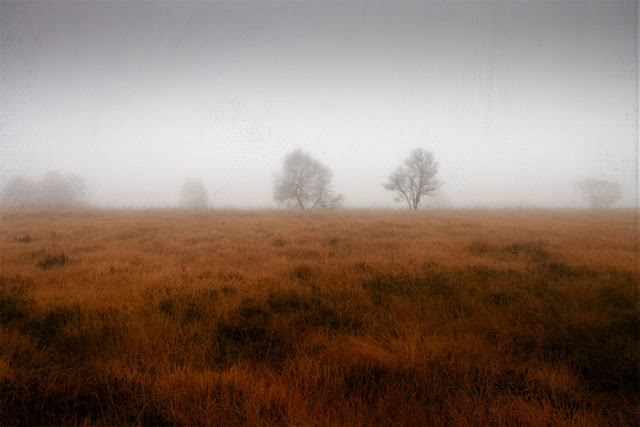
I thought this misty forest scene could be turned into a mystical exquisitely work:
I wanted to use textures and enhance the colours which isn't always manageable with texture only so the idea of using a gradient came into play. I was also keen on using some of my new textures to demonstrate how they turn this rather ordinary scene into something special and magical.
Texture Choice
I added some textures with grit & grain to the last pack and thought that they would go nicely with this scene adding some kind of "fairy dust" to it. Here are the ones I chose:
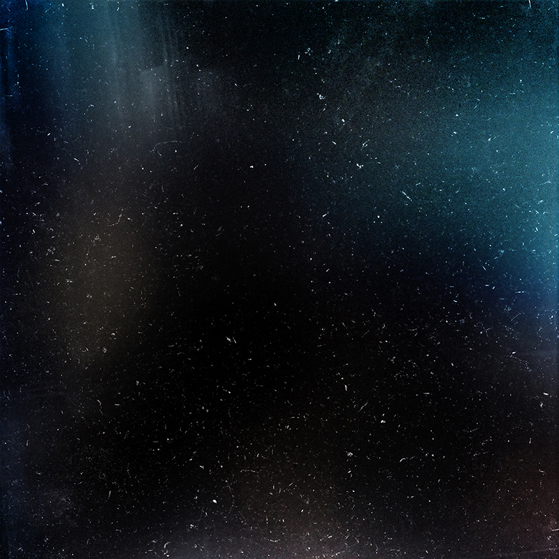 |
| G & G Universe |
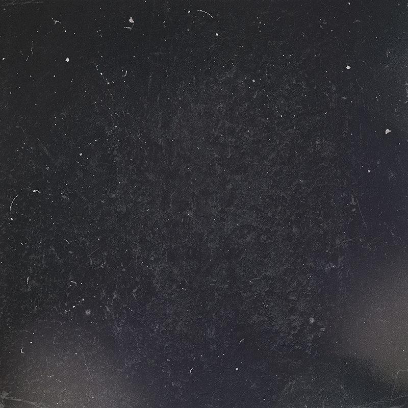 |
| G&G Winter Eve |
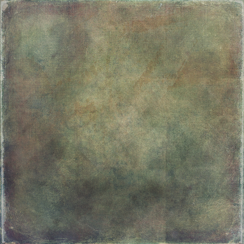 |
| Shadow Magnets |
You'll find this textures here:
Mixed Specialties
The G & G textures work best with blending like screen, lighten or color dodge, but can be used with other modes as well (as I found out with the first one)
After applying the textures I got the following result:
Adding a gradient
As I said before, I wanted to have strong colours but they still had to fit the overall mood and if possible the existing tones of the picture. So some red/orange and some blue should was the target. From my work on Stackables I had some unused texture I selected for this purpose:
 |
| Harmony grd |
The blue seemed to be going quite well with the blue hues the G & G texture added on the right side and the orange would enhance the foreground.
...and it did.
For a better overview of the processing here is the screenshot of the layers I used:
As mentioned before I didn't use screnn/lighten/ color dodge with the g&g winter eve texture, but with multiply I got a better effect with the other textures on top and the grain was not so obvious, but still recognizable.
I played around with the gradient for quite a while and ended up with 40% Color Burn as the perfect setting.
As always I worked on contrast and colours to achieve the tones and atmosphere I liked best.
Thanks for reading!
Don't forget that there is currently a huge DISCOUNT of 25% on my textures over on my HOMEPAGE just add the coupon code MAY2014 at the checkout!!


Comments
Post a Comment