Hello all,
I thought it is about time to give another insight into my texture creating process.
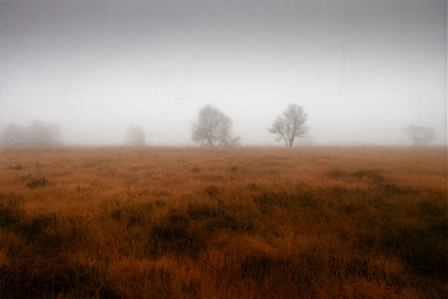
But let me start with a picture that I used this texture on:
 |
| Wild Coast La Palma |
|
Creating Misty Fountain Texture
It is one texture from the
Spring Release Pack
It is based on a shaky long exposure shot of a fountain I took a few years back. It wasn't really anything special:
I really liked the texture of the water and the colours and when I came across it recently, I decided to give it a try and started creating a texture.
First i had to ge rid of the dark parts of the construction, so I loaded the picture into Photoshop and began replacing these parts using the clone stamp and other tools until I got this:
Next thing was to do something about the colours and trying to get a more balanced structure. I decided to duplicate the layer and rotate it by 180°. With a opacity of 50% I got this:
Now I wanted to try to get a more uniform coloring. I thought using a colour gradient overlay might be the right choice. I chose something from yellow to brown and played around with different angles and types of settings and got this:
I made the top part of the texture lighter by adding a white gradient and took two different textures that I used to further refine the texture and the light. A dark photo of slate stone helped to add a vertical structure.
Although I liked the outcome, I thought a texture based on a fountain ought to have a colour that reminds people of actual water. I added a Selective Colour layer and began manipulating the colours - less red and yellow and mor cyan and blue. The colours now were to my liking. I made the whole thing a bit lighter and tweaked the blue a and yellow a bit and got my final texture:
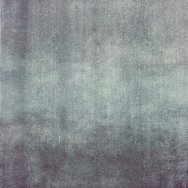 |
| Misty Fountain |
This is what the actual layers in Photoshop look like:
I also used the texture on the following pictures, but I also used other textures from my various packs...
10% Promotion
I am prolonging my texture promotion until April 30, 2013!!
If you enter the couupon code
AprilFun
at the check out you'll get 10% discount on all purchases!!!
My Texture Packs for sale
Hope you found this interesting & thanks for reading!
Dirk


Wow, loved this insight! I still have to try to create my own, but I have a long way to go...
ReplyDeleteThanks Miriam.
DeleteVery interesting. Thank you for posting this. I think the last 2 images are my favorites. Almost makes it look like aged photos.
ReplyDeleteThank you Richard.
DeleteNow I know just how really hard it is to make your wonderful textures. Thank you for sharing this!
ReplyDeleteYou're welcome & thanks very much!
DeleteI would love to purchase texture packs... can I do that from the US?
ReplyDeleteHello Lyne, yes, that is no problem at all. You pay by Paypal from anywhere in the world.
DeleteAn interesting creative insight into how you make your textures ~ great!
ReplyDelete