Featured

One photo - three creative edits in Luminar Neo and Photoshop

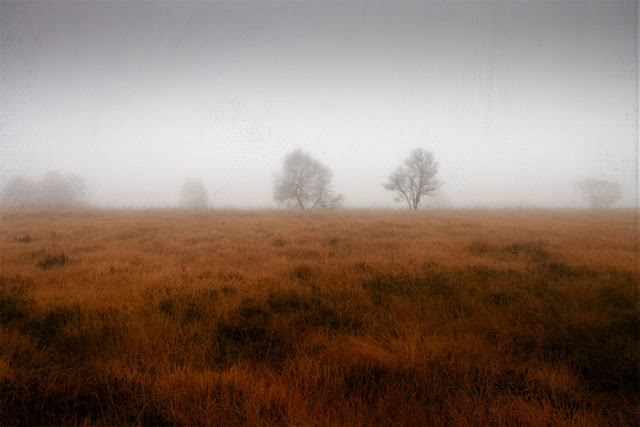
 Creating Three Moody Images out of One Shot I initially didn't plan to create three or more different images out of this photograph. I wanted to see how I can edit this foggy somehow chaotic forest image in Luminar Neo. I liked the atmosphere and I can still recall the morning I took this photo. I knew I had to make a lot of chnages , because of all the distracting twigs on the left and right hand side as well as at the top of the frame. First Step - Editing in Luminar Neo I usually develop my images in Lightroom Classic  but decided to use Luminar Neo this time because I wanted to see how their various creative in part AI powered tools inspire me. Basic edits were quickly done. I usually start with Luminar's Enhance AI, I found this tool often leads to considerable improvements to build upon. I then moved to the Develop section to make further basic adjustments such as exposure, highlights, shadows, contrast and so on until I am satisfied.  As this image has almost no colour

Free Texture Wednesday 5 - Vintage Style

I am sorry, but I didn't have much time for a new blog post, because I had trouble with my internet connection and that had to be remedied first.

Therefore today there is a little tutorial & a free texture.

I think I found a good example for a texture, that makes a vintage look quite easy to achieve. and is also easy to use.  I created this lovely river scene with the dunes in the background. I took this picture last year during a trip to the south - west of France.


Vintage River


The texture:
Click here to down load the full size texture

yolk


Short tutorial:

As I mentioned before, this is quite easy to use. 

This is the original, that had quite vivid colours, but these are not necessary, it should work with all kind of pictures, but I think it is best with landscapes.


layers
As always it is a game of playing around with some of the blending modes and other tools that Photoshop provides. I usually start with multiply and if this is too strong I change to soft light, both set at 50% opacity when I start. The first texture layer provided the basis for the vintage look. As you can see, I stuck to multiply and finally set the opacity to 64%.  The copy gave the clouds a soft yellow glow. After that it was only a little colour and light adjustment.

Hope you found this helpful.

If you like textures, you might like the ones I am offering in my Build your own texture pack
Thanks! 


Comments

  1. I never thought of using the same texture twice with different Blend Modes. Thanks for the tip!!

    ReplyDelete

Post a Comment