Hello,
Recently I kind of re-discovered my own
Build Your Own Texture Pack and actually used some textures, that I had forgotten about.
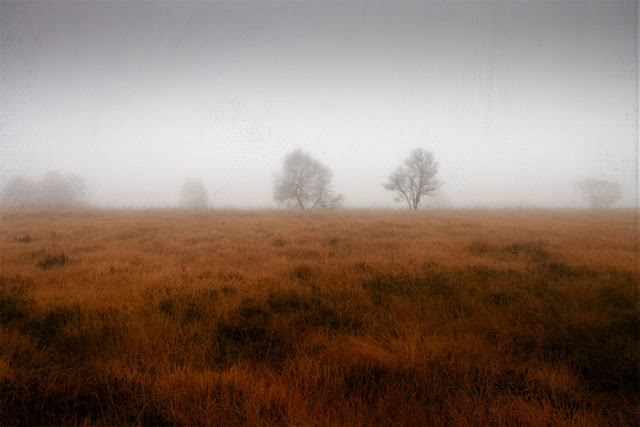
Today's picture is once again some very moody autumn shot taken a few years back on a foggy November morning.
I am still waiting for similar weather, but "unfortunately" this year's November didn't offer these weather conditions over here....
Let's start with the finished image. Mouseover will reveal the picture that I imported in Photoshop.
 |
| 11th month |
Processing in Lightroom
I started with this RAW photo:
 |
| 11th month RAW |
First I treated the exposure. I aimed at making it brighter avoiding to blow out the already light fog while retaining the soft silhouettes of the forest in the background.
Then I wanted a different mood. I initially had a much colder atmosphere in mind, so I initially went for a more bluish tone in the fog which I achieved with a colour temperature around 5000K.
 |
| 11month blue version |
This version didn't work for me, so I went in the opposite direction and that resulted in a very soft and much warmer yellow tone that I liked somehow much better.
I tweaked the tone of the grass, the contrast of the tree in the foreground an some other details until I exported this version of the picture to Photoshop:
 |
| 11th month Lightroom |
Applying textures
After some playing around I ended up using two textures from the pack, pls follow the link for a closer look at the textures:
*The percentage numbers beside the blending mode are referring to the Opacity of the layer!
The tone and soft grunge look of Old Stories was a great addition to the tones I achieved in LR.
I didn't want to have the rainbow look of the 2nd texture, but really liked the structure, so I added a clipping mask to convert the texture into b&w. I also added a layer mask to recover the soft red pastel tones of the texture at the bottom to add some red tones to the grass.
I finalized the picture by adding slightly more contrast and conducted minor color adjustments.
Opacity vs Fill
People have been asking me
about the difference between Opacity (German Deckkraft) and Fill (German Fläche), because until recently I used both sliders without bothering whether this is correct or not. The only thing important to me was the result I saw in my picture.
Because of your questions I started
to investigate about this and found out, that the Fill - Slider isn't really necessary, if you work with textures. It has no impact other than reducing or enhancing Opacity. So actually every texture effect can be achieved by only changing the Opacity of a layer in combination with a blending mode.
Thanks for your interest!
Have a great week!
|


Comments
Post a Comment