Hello,
with September already on its way and autumn & winter approaching there will be plenty of bad weather and the chance to take some moody landscape shots. So I thought I once again do something on texturizing foggy landscapes and enhancing/creating the unique atmosphere these kind of conditions have.
Following one of my first posts that dealt with texturizing fog
Adding Mood and Fog with Textures I want to show some additional techniques to process this kind of shots.
Recently I edited a bunch of pictures where I wanted to enhance the already moody atmosphere and was looking for other ways to use textures on them. After a lot of playing around I got the best results when using at least one texture in blending mode NORMAL.
All of these texture have a few things in common:
- they have a fine structure
- they have a more or less strong cloudy appearance
- they are rather light
- they are not very colorful
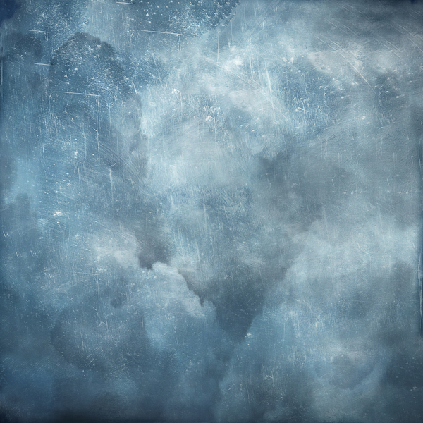
Let's start with my most recent picture. Here the effect is more subtle and the fog/ mist has still a natural feel. (though the colors I chose counteract this....)
 |
| Cold Mirror |
|
I chose a cloudy texture for this subtle effect, that added some mist in the darker parts of the picture. I used a layer mask to erase some of the texture in the lighter parts of the image.
Settings were:
Blending mode: Normal
Opacity: 50%
Fill: 70 %
 |
| Storm Clouds |
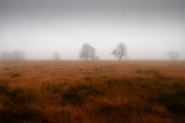
Adding Fog - Reducing Contrast
In the next picture it was important to get a more balanced appearance. I didn't want to crop out the dark trunks on the left side so I had to come up with a solution to reduce the contrast.
 |
| Empty Forest |
|
My texture of choice was
White Screen
 |
| White Screen |
With a setting of 50% opacity and 70% fill and a layer mask erasing the middle I got a nice misty overlay of the dark trunks.
Another example were I used a texture which is particularly good a reducing contrasts, is my picture "Cold to the Bone"
 |
| Cold to the Bone |
|
I used my texture
Pergament from the
Soft-Grunge-Textures-Bag:
 |
| Pergament |
The setting was
Blending mode: Normal
Opacity: 60%
Fill: 100 %
As mentioned before the best results you achieve with subtle & light textures. These you'll find in my
Build your own texture pack or in the
Soft-Grunge-Textures-Bag
Brighten the picture using HARD LIGHT
You should also try the blending mode HARD LIGHT at a rather low opacity (< 20%) in combination with the NORMAL mode. This will add a little more texture (so use a rather fine one) and also lighten the overall picture.
That's all for today. Enjoy the fog.


very nice! i did enjoy the fog!=D
ReplyDeletegreat tutorial! thank you! lovely fog
ReplyDelete