Hello,
today I have chosen a photo of a very frosty and cold winter morning from last year. It is a suitable example of how I texturize my pictures these days. I more & more use Photoshop's opportunities to selectively apply my textures using layer masks, different blending modes and gradients. To keep it simple and for you to better follow what I have done, I have limited myself to essentially three easy techniques in this photo (usually it is a lot more work....)
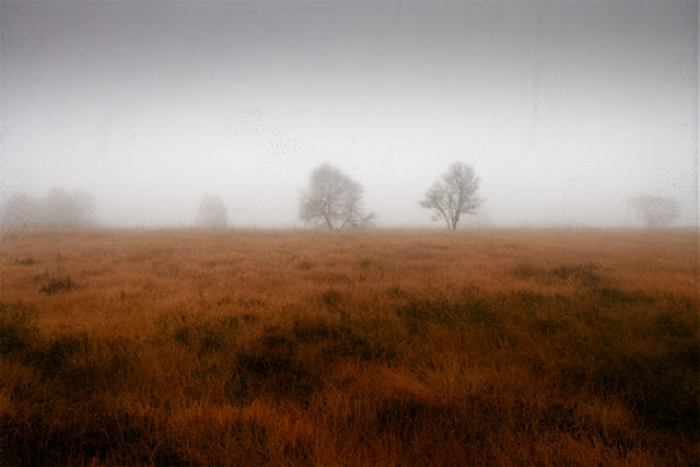
The final result:
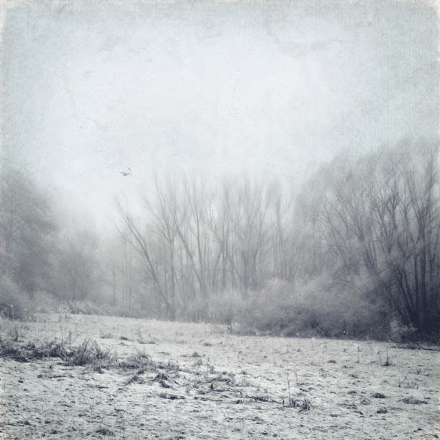 |
| Frosty Morning |
Creating a Vertorama
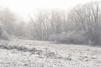
To create this view I stitched these two pictures in Photoshop and created a vertorama. Here are the two photos before I combined them in PS:
 |
| FM 1 |
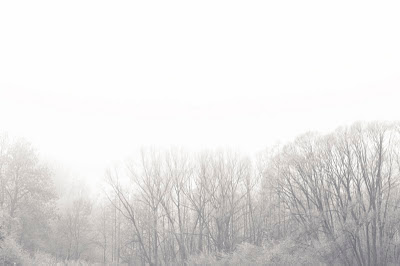 |
| FM 2 |
The vertical panorama that was the start for my further processing looked like this:
What I really like about stitching photos is, that you get a very large photo to work with. This is about 25 mp large!
Processing with Textures
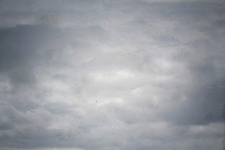
There is no colour to speak of (and this is not a b&w conversion!) and the sky was just plain white or the clouds were not discernible. So I wanted to add some structure to the sky. Browsing through my texture files I came across my Light Grunge texture that I wanted to have for the sky:
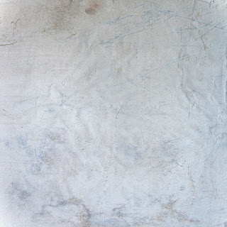 |
| Light Grunge |
I selected only the sky and the bright parts of the tree tops and erased the rest of the texture to get some structure to the featureless white sky.
Next I chose my "overcast" texture, because I hoped to brighten the middle part of the picture, especially the trees and the bushes.
 |
| Overcast |
As this texture provides a vignette ( a brighter middle) I was satisfied with the effect it had by using only a blending mode (overlay). I didn't have to erase any parts of the texture - so sometimes selective texturizing can be achieved simply by chosing the right blending mode and texture.
But the picture still looked a bit dull to me and I wanted to have some cold blue/green hues as well as a subtle vignette. Instead of adding a colour gradient I thought of achieving this by using a texture. My eye fell on another one from my texture pack:
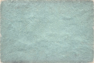 |
| paper & stone |
Tone & texture seemed perfect for a vignette. So dragged it on to my picture and added a layer mask. I chose a soft brush and erased (painted away) the middle of the texture. (Please take a look at the layers)
Next I had to balance the green tone of the whole photo and added a colour layer. Finally I enhanced the contrast a bit and the picture was almost done. I couldn't resist to add two birds using brushes. Once again I am indebted to the brushes that
Shadow House Creations provides:
Bird Brushes
Please check the copy of the layers to see how I blended everything and if you have any questions please don't hesitate to contact me.
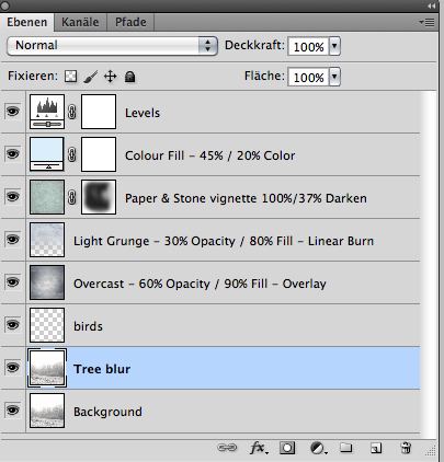 |
| Layers Frosty Morning |
As mentioned before, the textures I have used are part of my
Build your own texture pack .
Thanks for reading!


this blog is just great! thank you so much!
ReplyDeleteI have never heard the word vertorama! Wonderful tutorial!
ReplyDeleteThis comment has been removed by a blog administrator.
ReplyDelete