Luminar Neo - My First Impressions
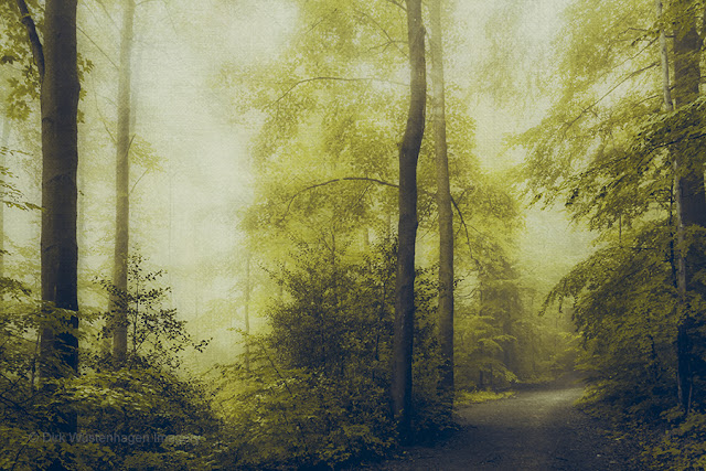
Mystical Woods - move mouse over for an before / after In December of last year I was asked whether I'd like to take a look and try out the photo edit software Luminar Neo. So I was provided with the program and the extensions pack. At the moment there are seven extensions available, I installed four of them that I thought could be useful in my workflow. These are Noiseless Ai, Upscale Ai, Supersharp Ai and Magic Light Ai. Until I was asked to try Luminar Neo, I had not heard of the program, but the opportunity to partner with Skylum and make some additional money convinced me to take a look. That means: This text contains affiliate links. What is Luminar Neo? Skylum's Luminar Neo is a photo editing tool that makes editing your photos quite simple. Many of its features are enhanced by artificial intelligence that lead to sometimes stunning results and are intuitive and easy to use. LUMINAR NEO - special offer until 28 February 2023 Lightroom and Photoshop plugin I almo